- 首页
- 产品中心
- 解决方案管廊安全
- 管廊监控的系统组成
- 管廊自控系统如何配置
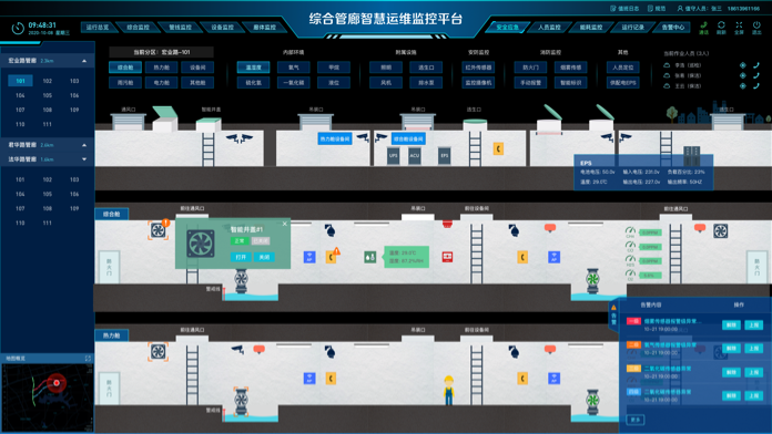
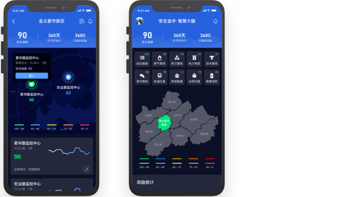
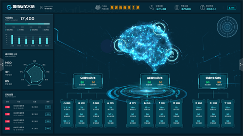
- 综合管廊运维管理云平台
- 管廊自动化控制系统方案
- 管廊结构健康监测方法
供热安全- 管廊监控的系统组成
- 管廊自控系统如何配置
- 综合管廊运维管理云平台
- 管廊自动化控制系统方案
- 管廊结构健康监测方法
给水安全- 管廊监控的系统组成
- 管廊自控系统如何配置
- 综合管廊运维管理云平台
- 管廊自动化控制系统方案
- 管廊结构健康监测方法
轨道安全- 管廊监控的系统组成
- 管廊自控系统如何配置
- 综合管廊运维管理云平台
- 管廊自动化控制系统方案
- 管廊结构健康监测方法
水网安全- 管廊监控的系统组成
- 管廊自控系统如何配置
- 综合管廊运维管理云平台
- 管廊自动化控制系统方案
- 管廊结构健康监测方法
燃气安全- 管廊监控的系统组成
- 管廊自控系统如何配置
- 综合管廊运维管理云平台
- 管廊自动化控制系统方案
- 管廊结构健康监测方法
供电安全- 管廊监控的系统组成
- 管廊自控系统如何配置
- 综合管廊运维管理云平台
- 管廊自动化控制系统方案
- 管廊结构健康监测方法
雨污安全- 管廊监控的系统组成
- 管廊自控系统如何配置
- 综合管廊运维管理云平台
- 管廊自动化控制系统方案
- 管廊结构健康监测方法
桥梁安全- 管廊监控的系统组成
- 管廊自控系统如何配置
- 综合管廊运维管理云平台
- 管廊自动化控制系统方案
- 管廊结构健康监测方法
- 关于我们
咨询热线: 13148466085